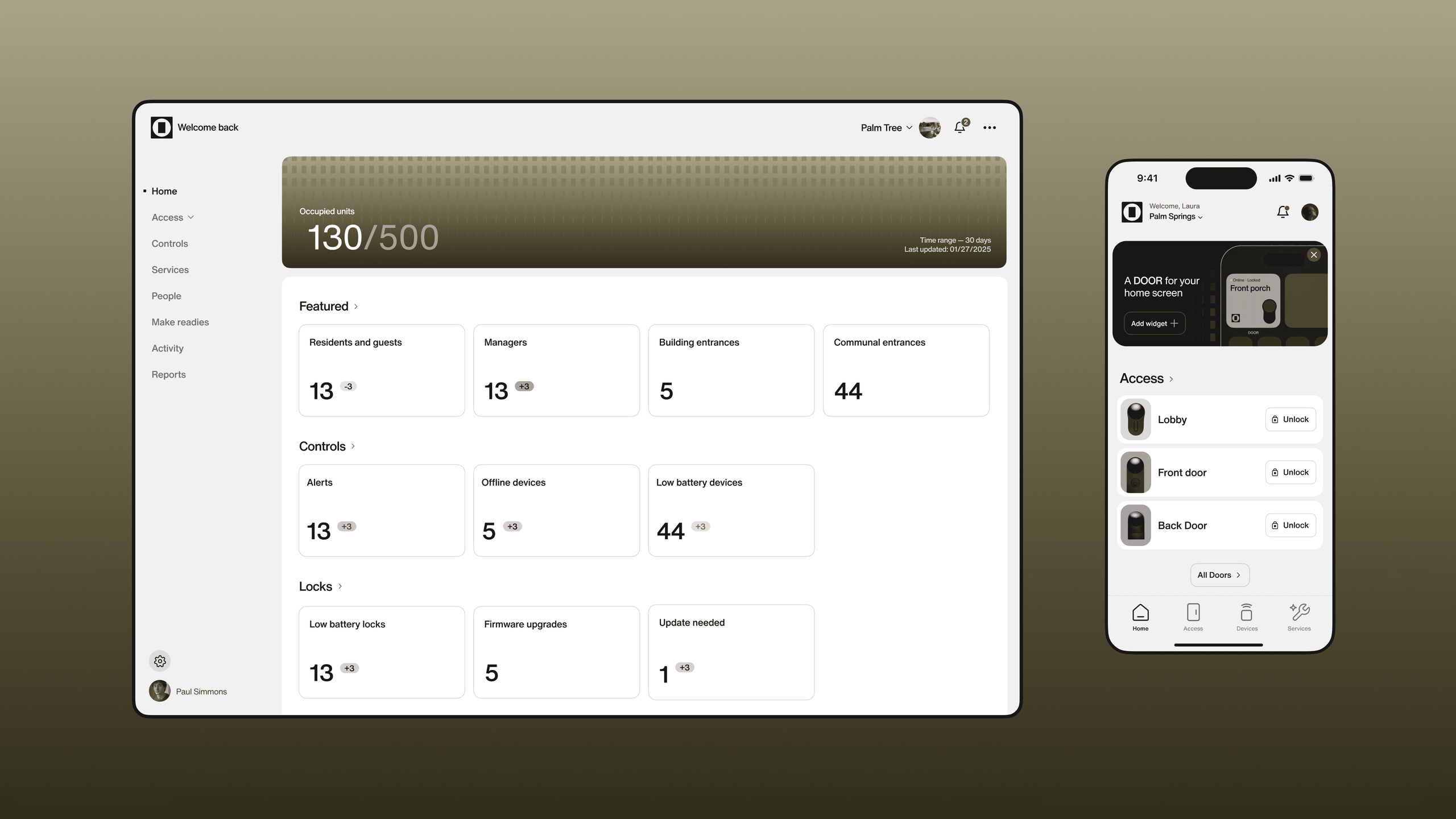
When Latch became DOOR, it marked a shift not just in name, but in ambition. The company was evolving from a single-product mindset into a full-stack platform shaping the emerging category of Building Intelligence. To support that transition, the brand needed to restore confidence, sharpen the story, and reflect the sophistication of a business now operating across hardware, software, and services.
At the centre of the transformation was a simple belief: smarter buildings should make life simpler. This idea anchored the purpose, mission, and vision, framing a future where buildings think ahead, reduce friction, and quietly improve everyday life. It also gave us a way to unite DOOR’s audiences — owners looking for long-term performance, operators managing daily complexity, and partners needing tools they can trust.
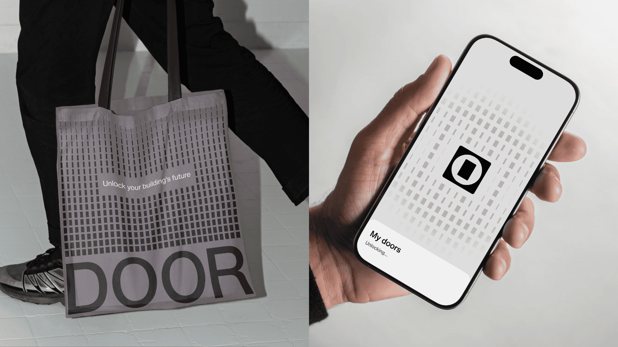
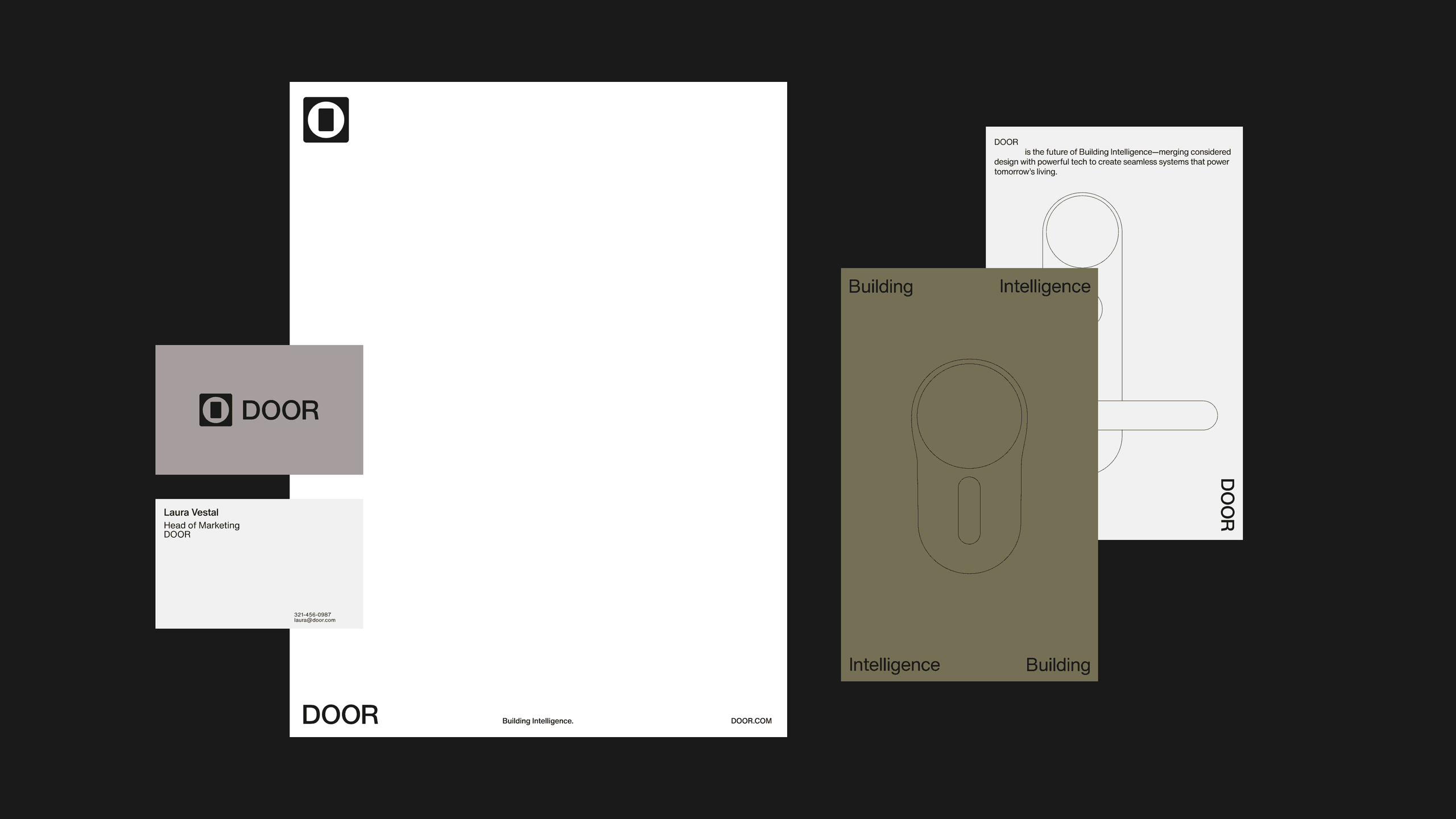
The identity system emerged from a key strategic insight: DOOR lives in the space between access and privacy, trust and control. The mark expresses that relationship through three elemental shapes, creating a structure that feels balanced, intentional, and quietly assured. Paired with a restrained palette and type system, the brand communicates clarity and precision to stand apart in a visually crowded category.
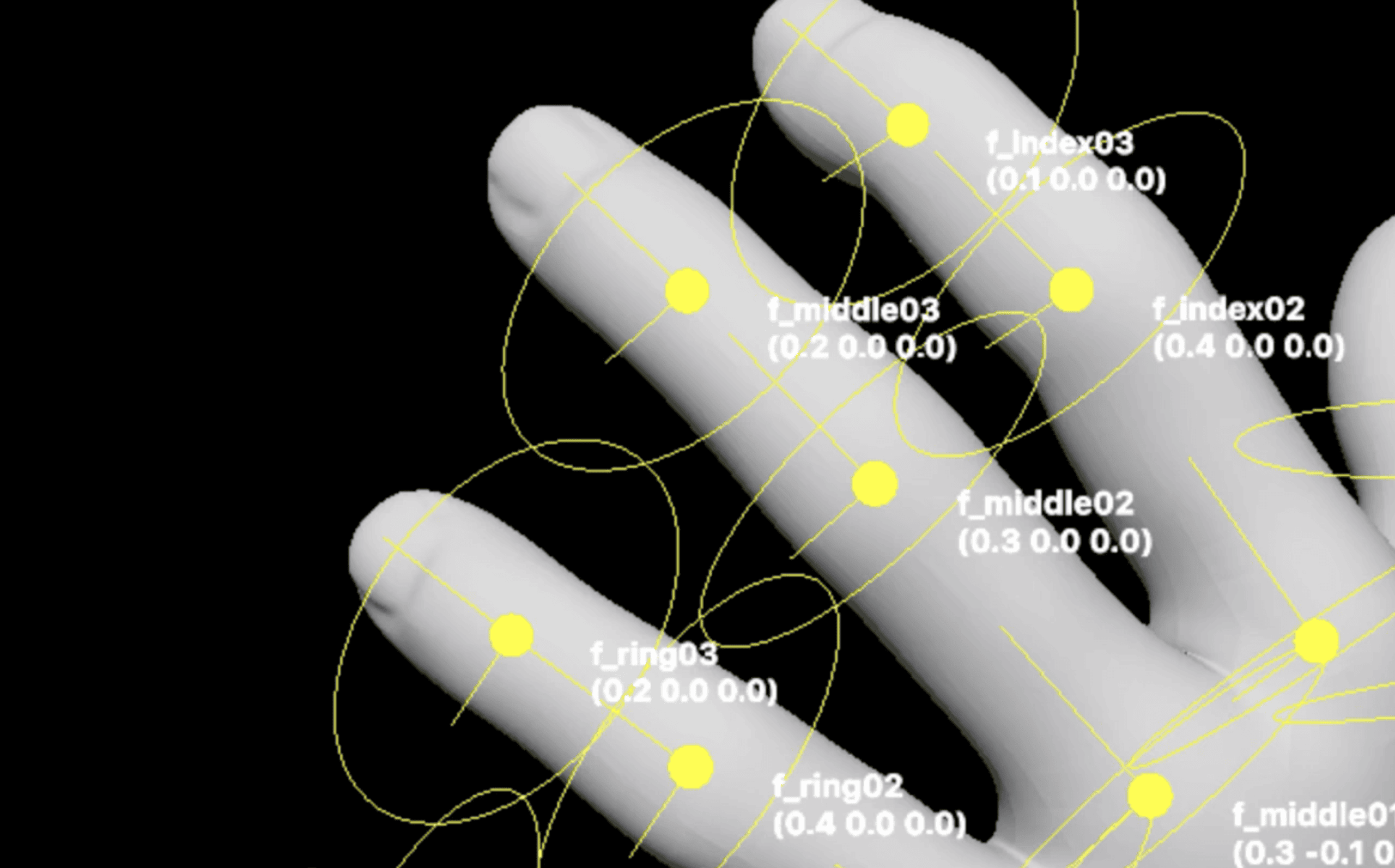
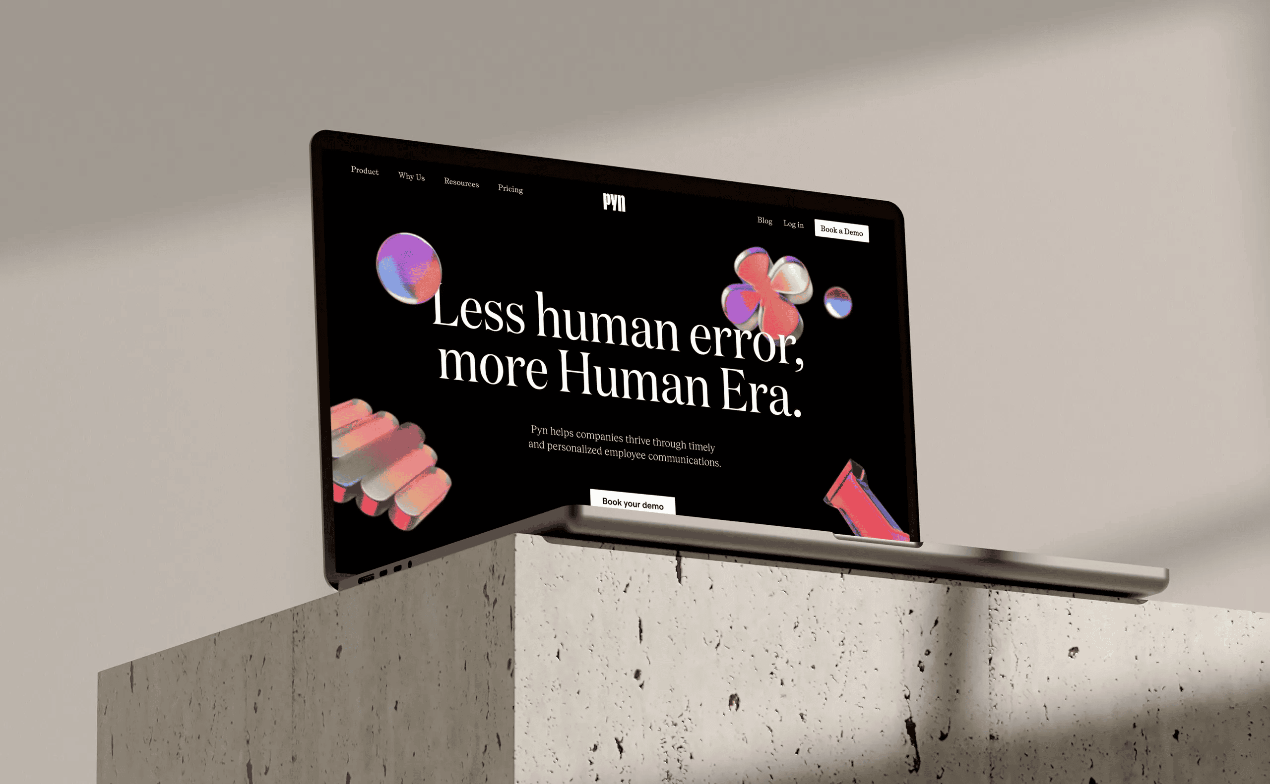
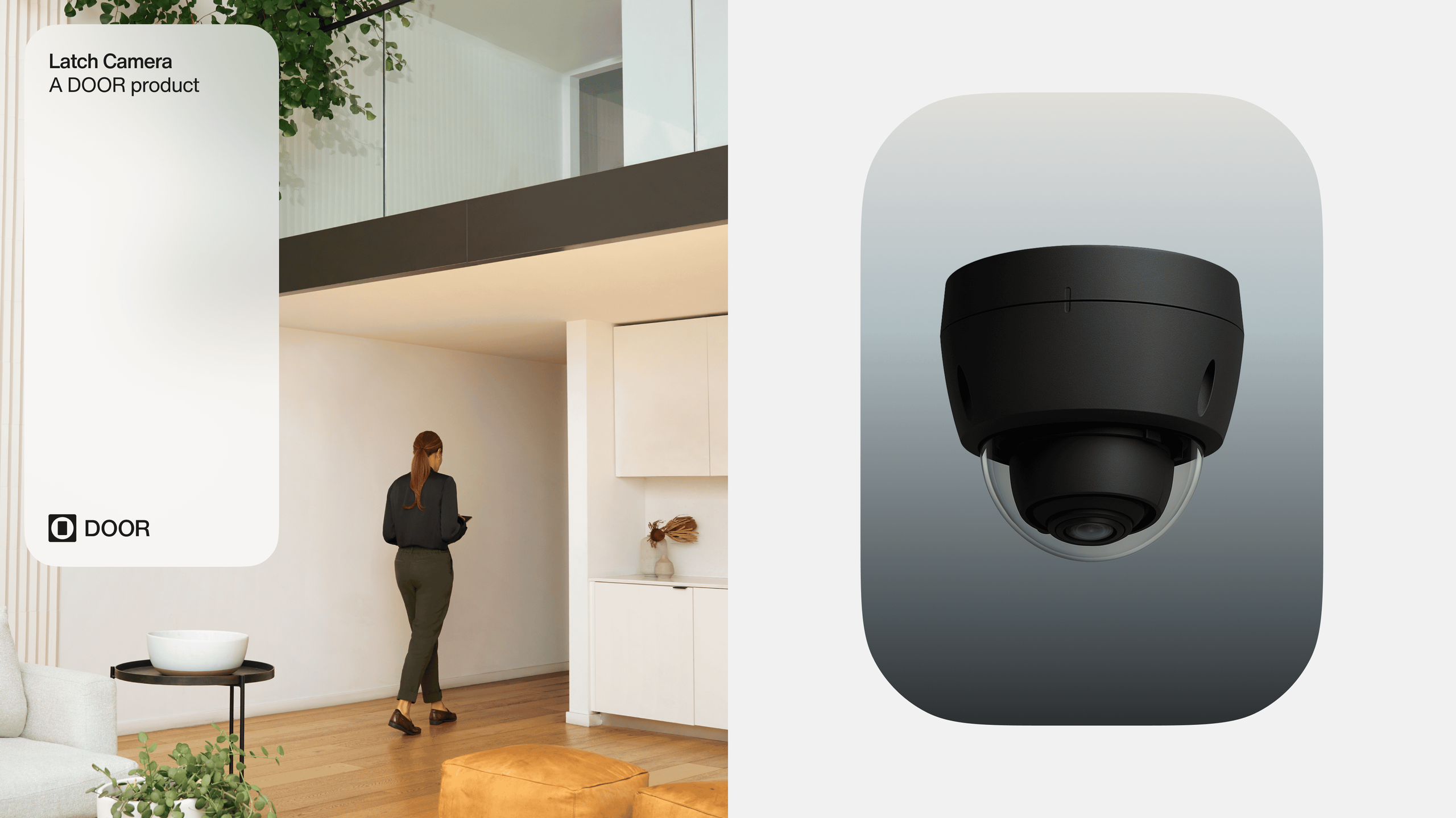
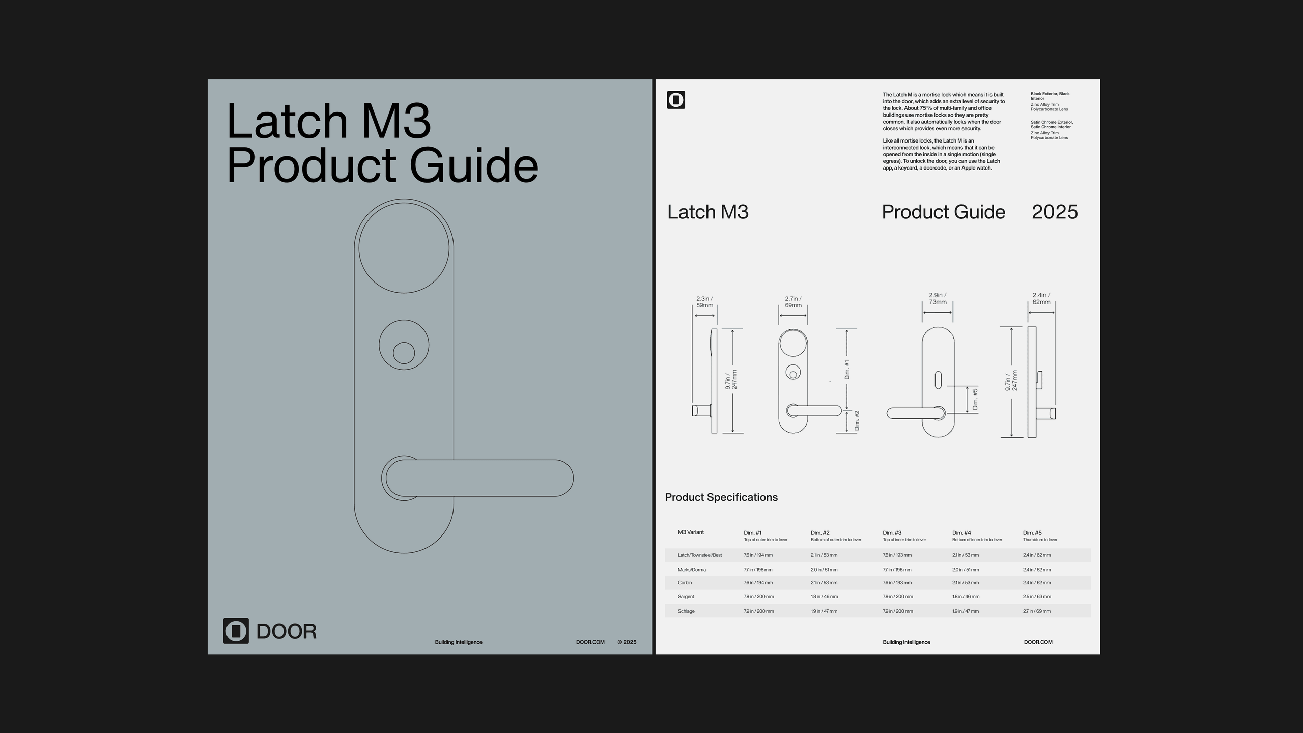
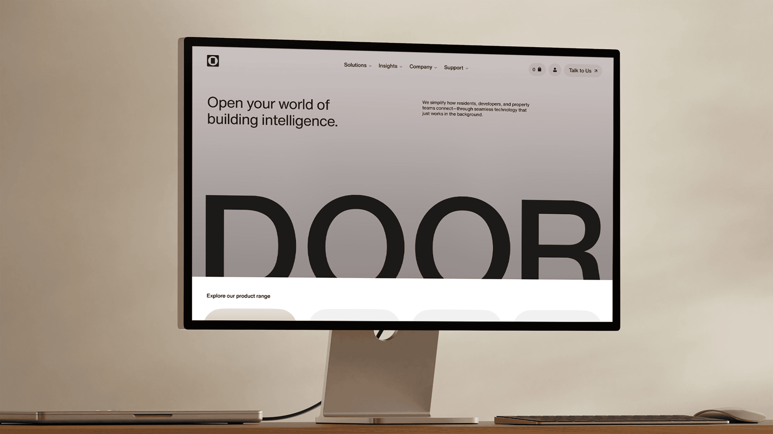
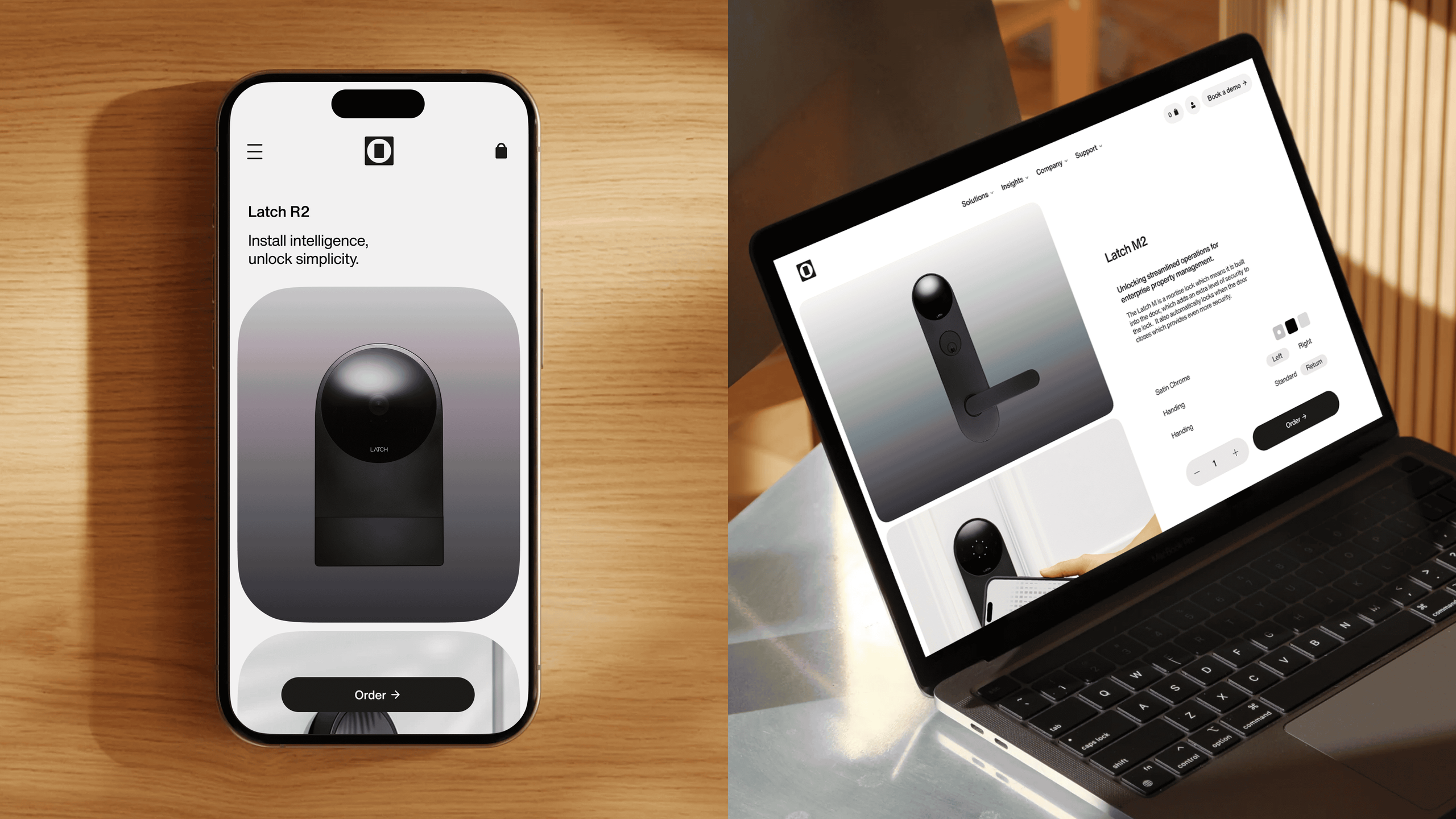
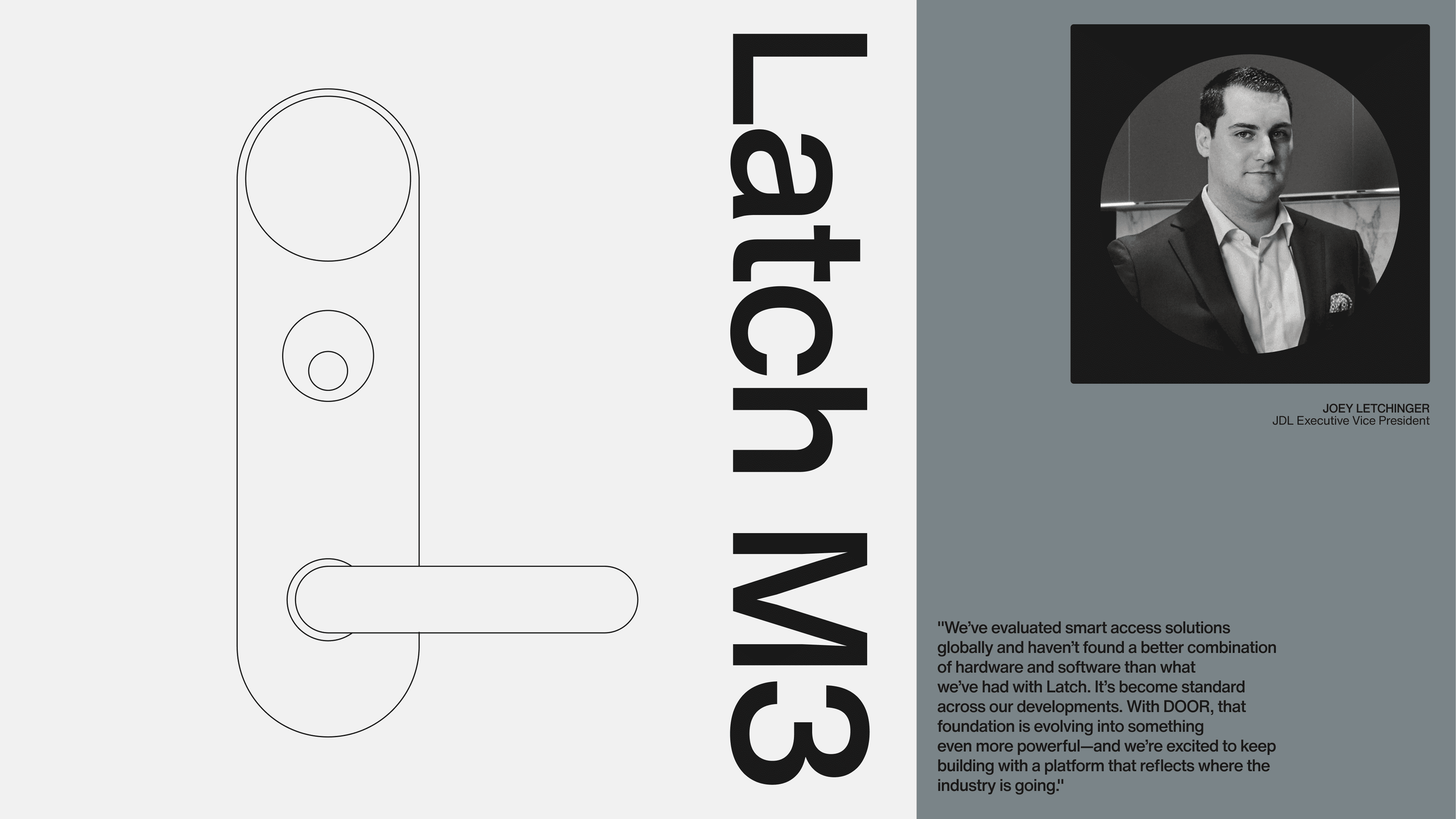
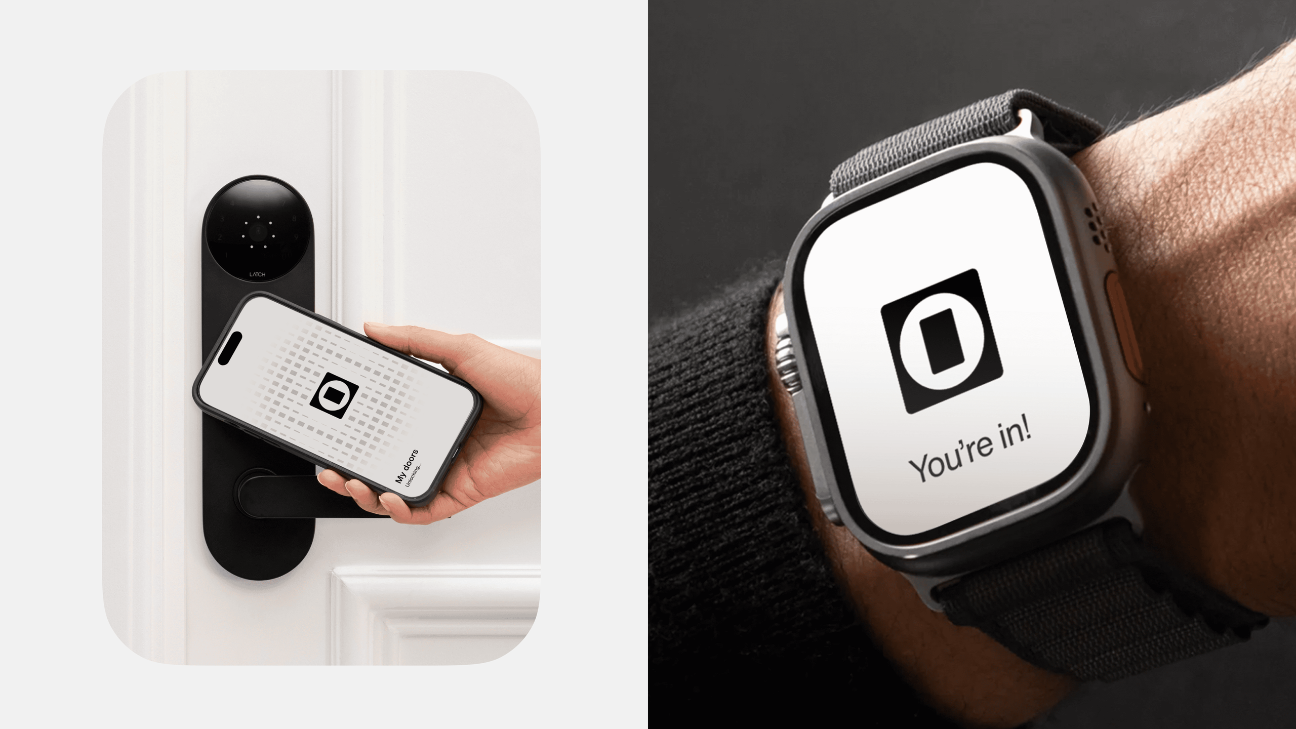
This foundation carries through every expression. The frosted-glass photography hints at warmth without intrusion. Product renders take on a clean and sophisticated quality, elevating hardware through material and form. Line illustrations and modular graphic patterns echo DOOR’s role as an integrated operating layer that's discrete components work seamlessly together. The result is a brand that feels effortless, dependable, and intentionally quiet: the same qualities DOOR brings to the buildings it supports.
“Josephmark was instrumental to the success of our transformation from Latch to DOOR. They brought uncommon strategic clarity, world-class creative, and a deep understanding of the business outcomes we needed to achieve. The result is a brand that reflects our ambition, restores trust, and positions us to lead the next era of Building Intelligence. They are an outstanding partner.”— Laura Vestal, Head of Marketing at DOOR

“Our rebrand demanded more than strong design. It required redefining our category and building a brand with the credibility, rigor, and premium quality our market expects. Josephmark delivered on every dimension. Their work gave us a coherent narrative, a distinctive identity, and a strategic foundation that is already reshaping market perception. They set a new bar for partnership.”— Laura Vestal, Head of Marketing at DOOR