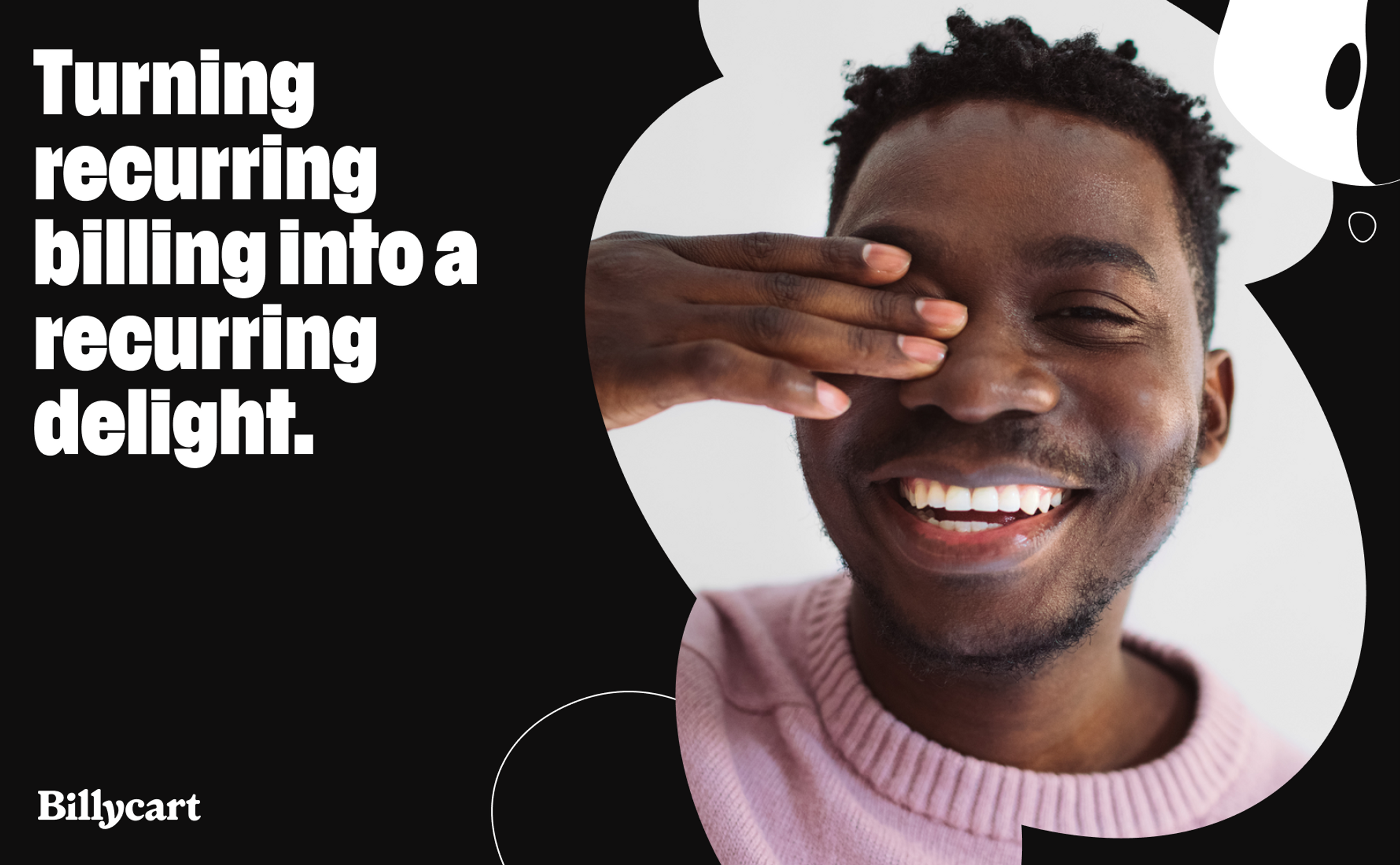
Billycart makes adding recurring payments easy as pie. As an official Square partner, Billycart is a payment management platform that equips businesses and their customers with more control, flexibility and transparency over their payment plans. Billycart shows customers that better relationships with their payments are possible.
Having secured an exclusive partnership with Square, Australian venture Billycart was gearing up to launch into the US market and needed a bold brand to cut through the busy fintech space. Our challenge was to create a brand capable of cementing Billycart as the industry leader in connecting people with their payments, while appealing to businesses and customers alike.

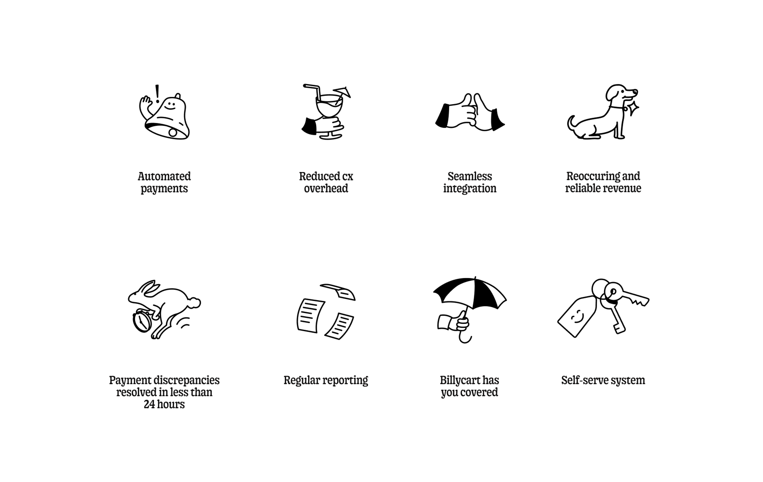
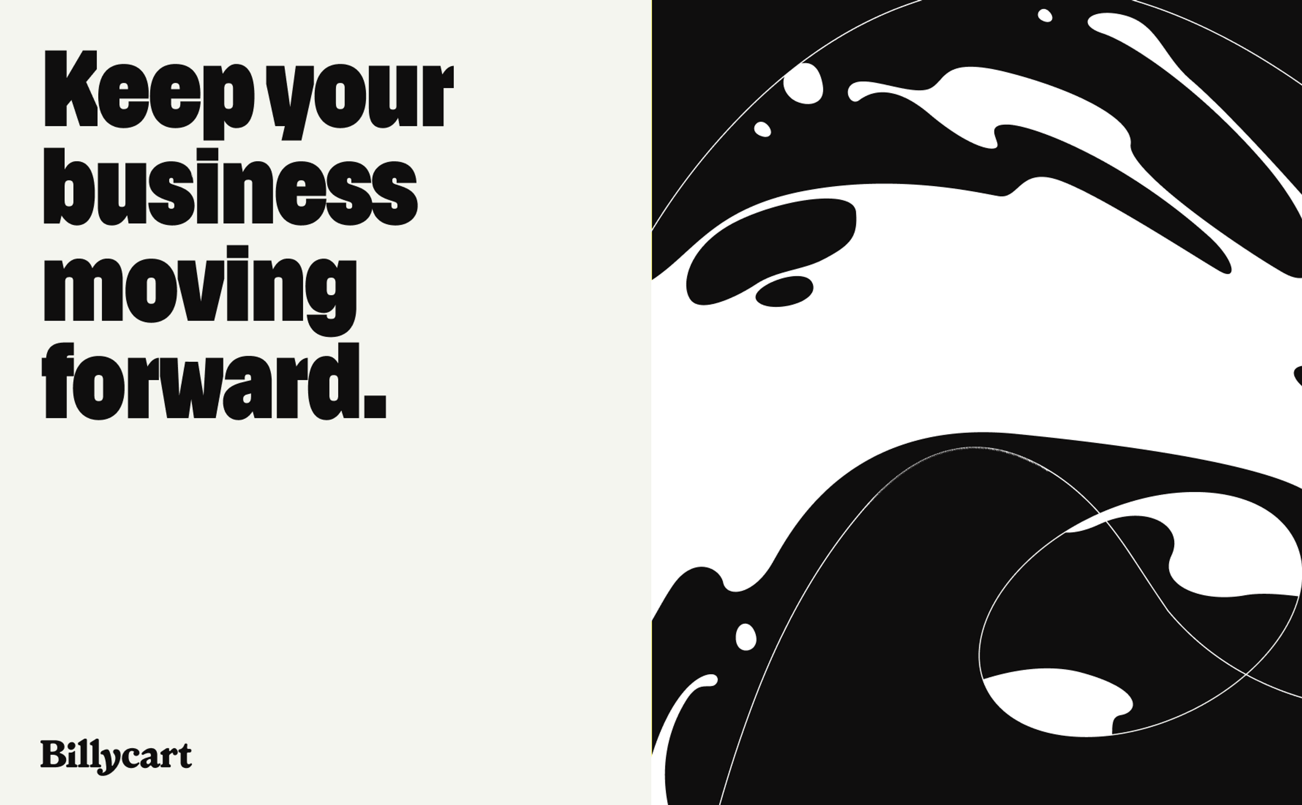
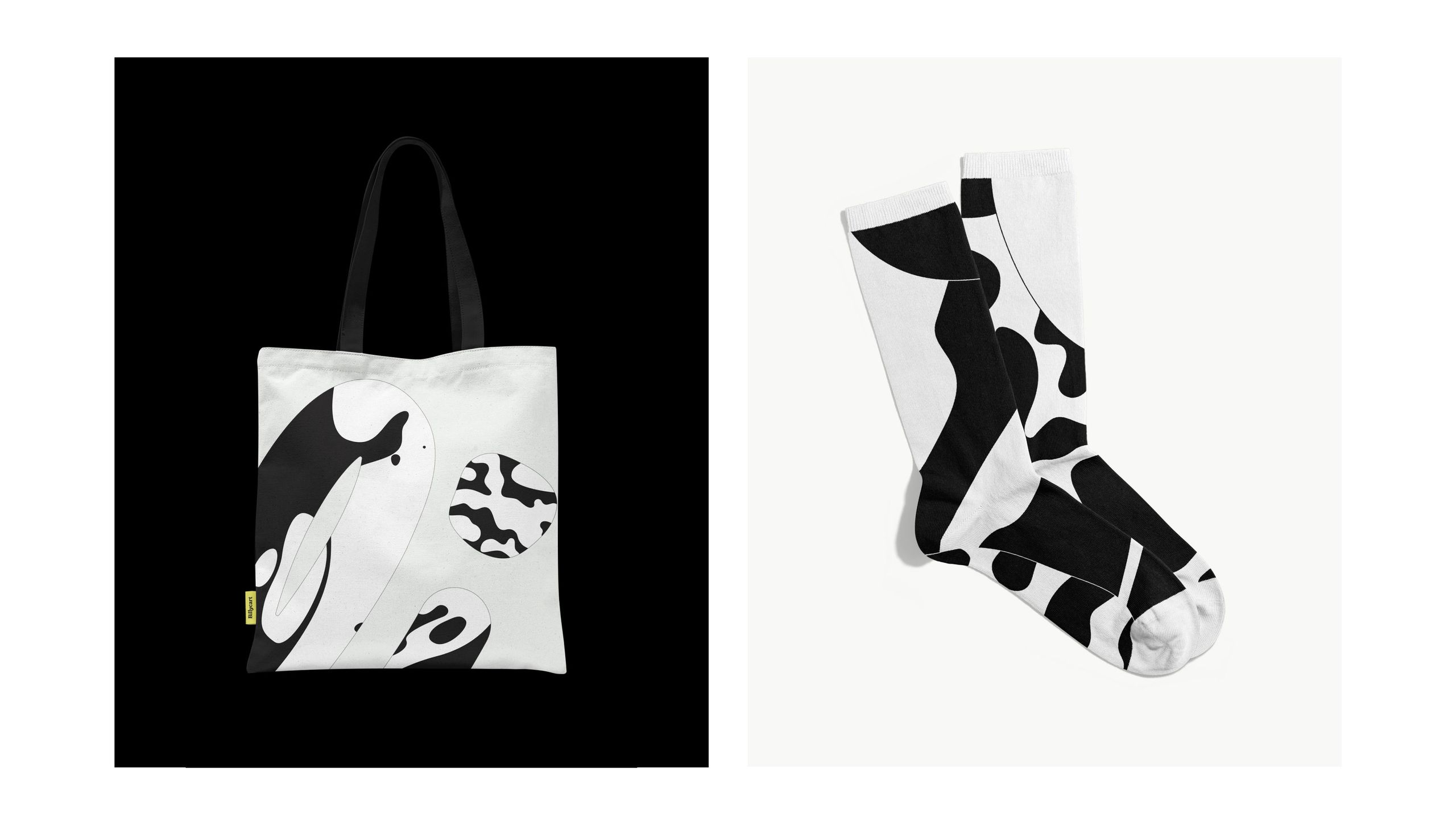
As practiced practitioners in the field of fintech, having created brands for Backpocket and Karma, our team deep-dived back into the world of fintech, creating a brand system that would inform every part of Billycart’s presence, from UX to market positioning. Our research and brand strategy informed the Billycart brand narrative, brought to life in its succeeding visual identity. JM lead the design and build of Billycart’s site, ready to showcase their new narrative and identity.
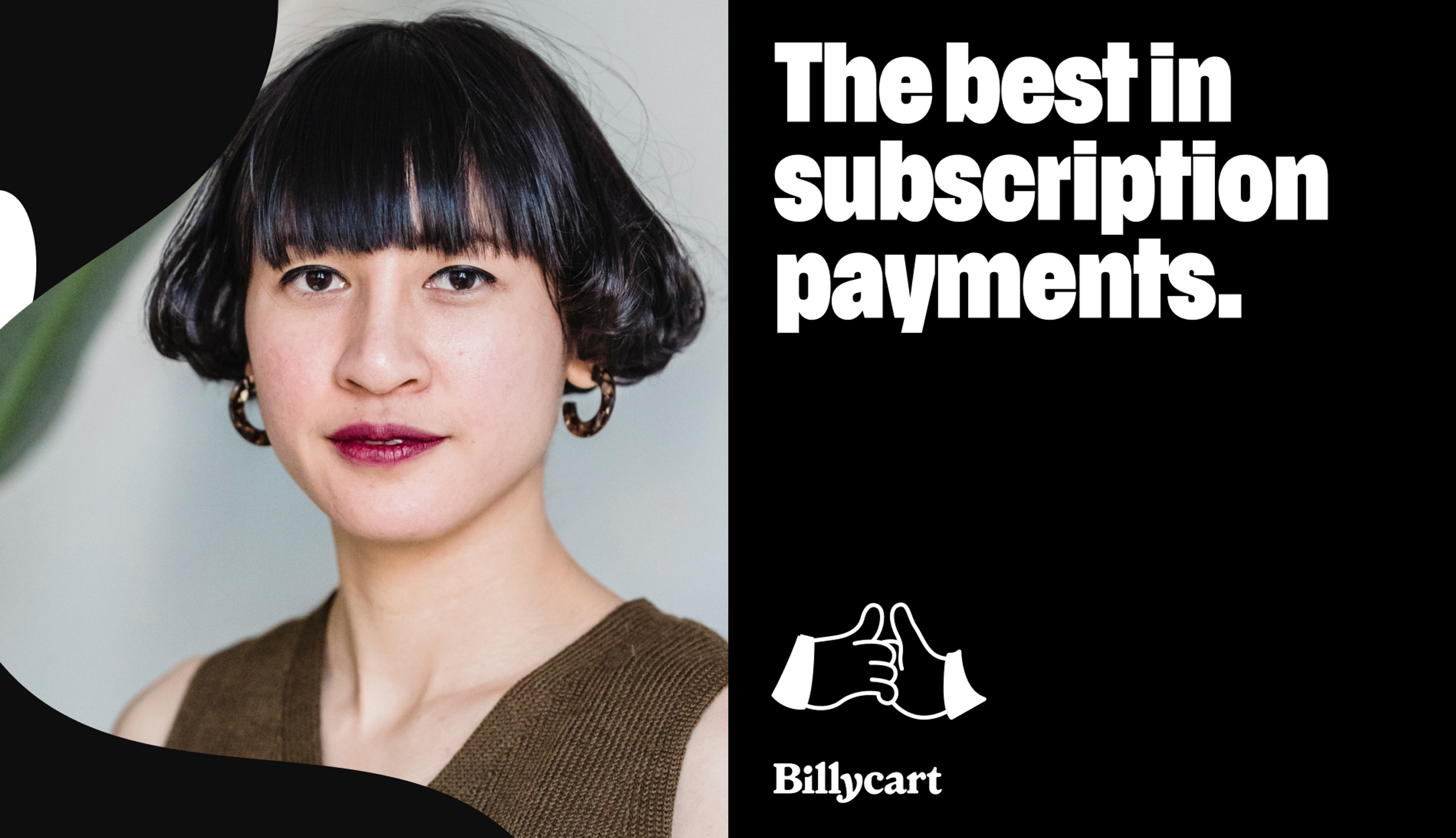
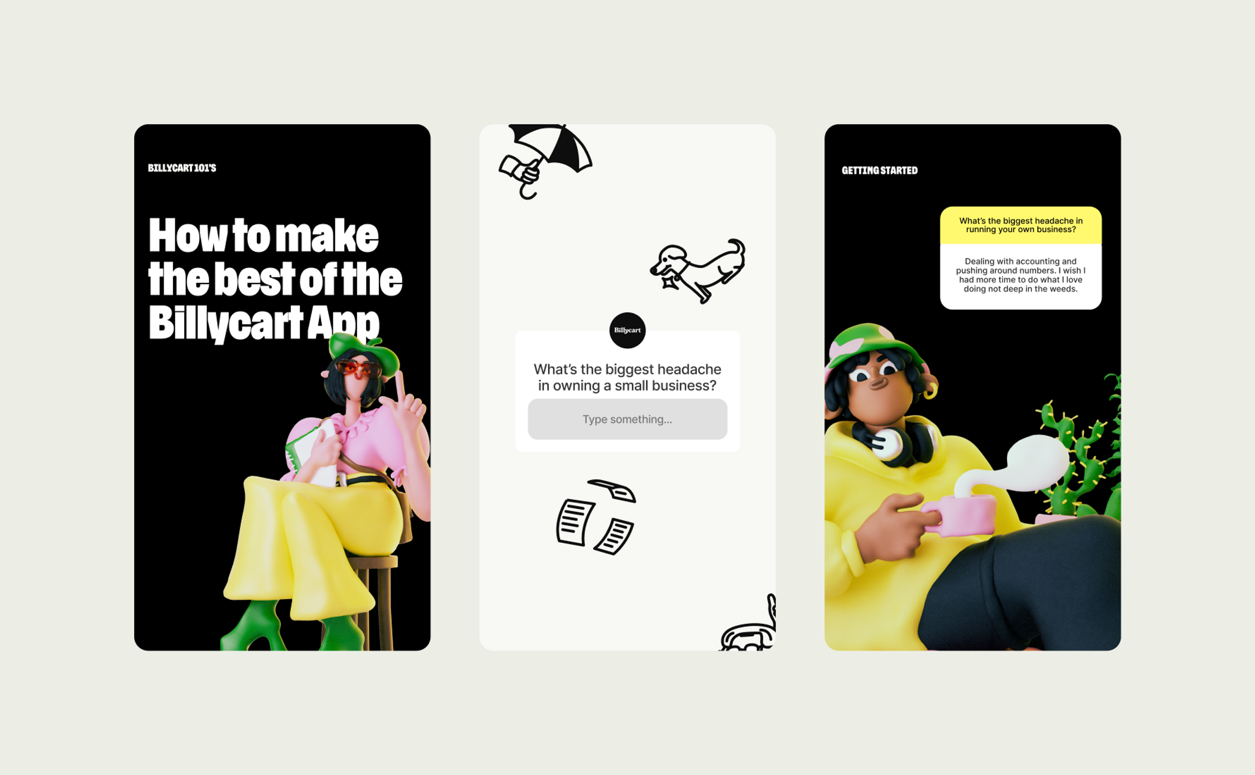
The final brand is human, adaptable, solid and clever, communicating both excitement and trust, while going above and beyond what people would expect to see in the market. Using the movement of a billycart as inspiration, we ensured this brand emoted forward progression and fluidity. Partnering delightfully quirky bespoke 3D characters that represent Billycart’s small business owners, with a bold black and white colour palette, the visual identity is memorable and distinguished against the saturated colourful array of competitors in the billing/payment market.
