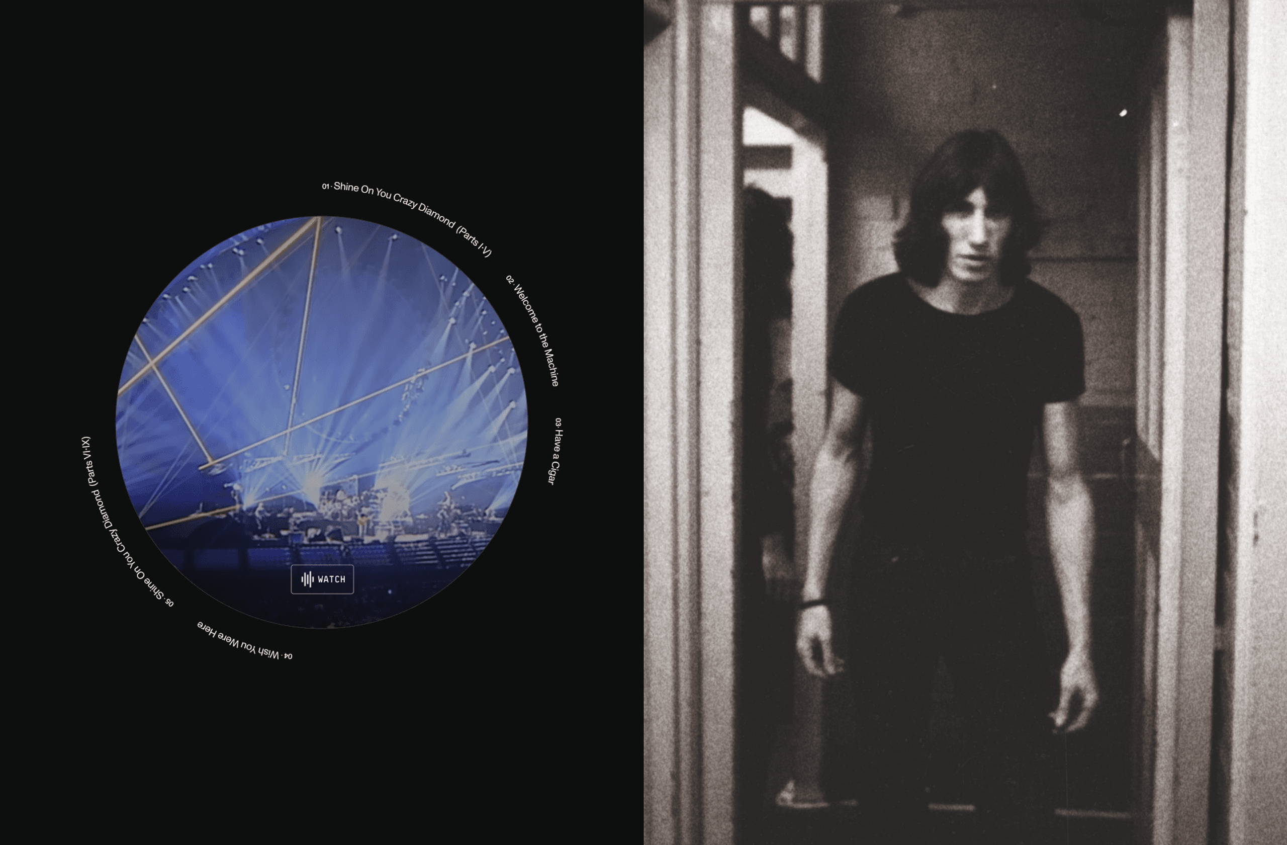

Pink Floyd’s world spans six decades of music, artwork, performances and cultural impact. Our role was to translate that breadth into a digital experience that felt worthy of its scale. A website that honoured the past while creating something built to endure.
Working closely with Sony’s Legacy team, we rethought the structure of the band’s online presence from the ground up. The previous site had become a catalogue of content; our aim was to transform it into an immersive archive shaped for discovery. We reorganised the band’s albums, artwork, tours and ephemera into a system that reveals their body of work as one interconnected whole.
Our design direction centred on restraint. By avoiding the pull of any specific era, we crafted an aesthetic that could hold them all; neutral typography, a muted palette, and an interface that steps back so the band’s own imagery can define the experience. Smooth interactions, measured pacing and subtle motion shape a sense of flow, creating a quiet backdrop for Pink Floyd’s iconic visuals to come forward.
A key part of the experience is discovery. Beneath the surface, we introduced an intentional, AI-powered layer that connects decades of material — linking album sleeves to tour posters, photographs to film, stories to moments. These connections are surfaced carefully, creating new pathways for exploration without altering the work itself.