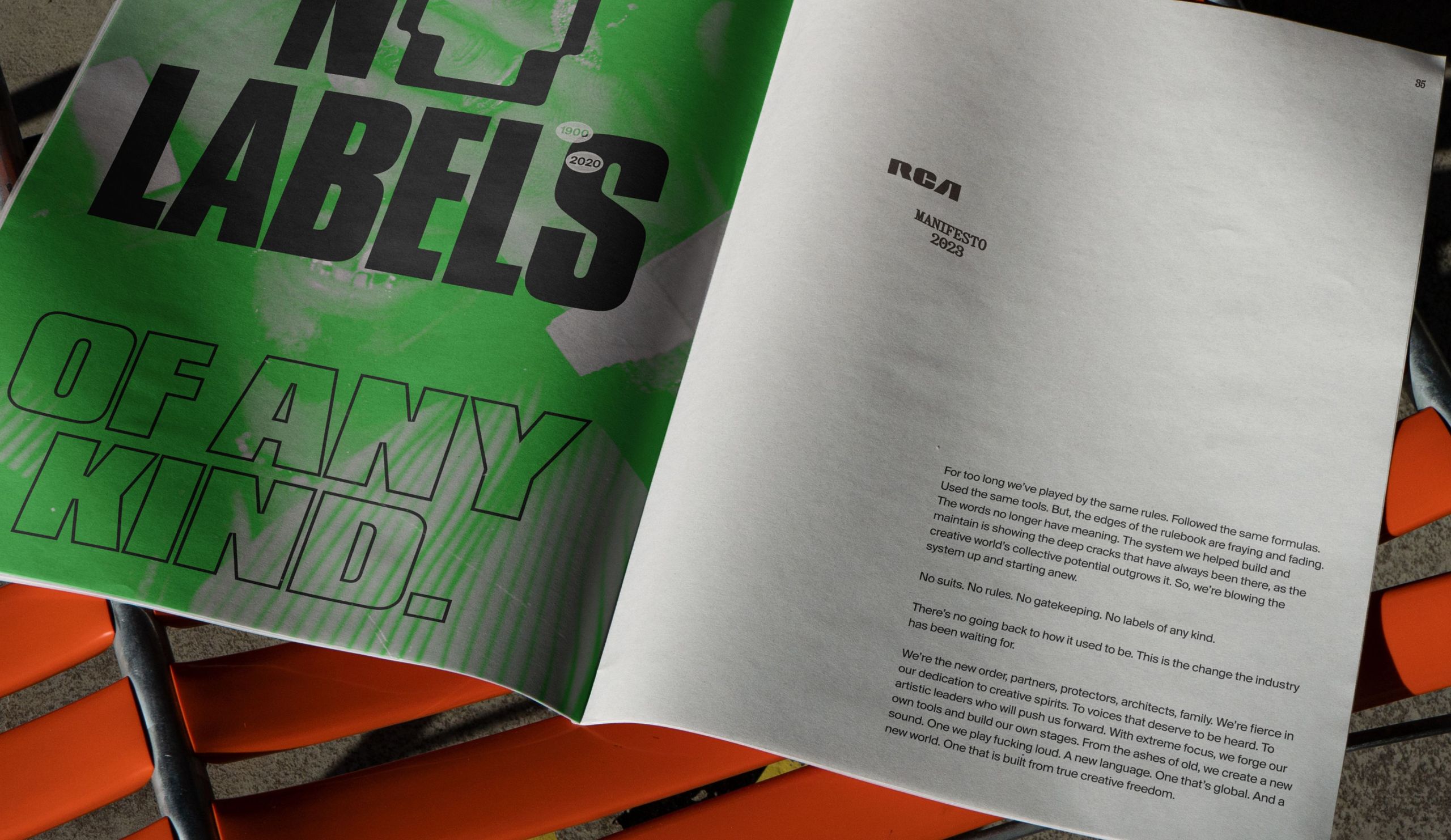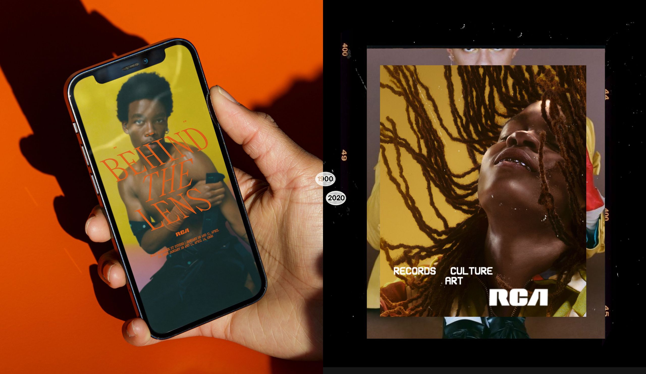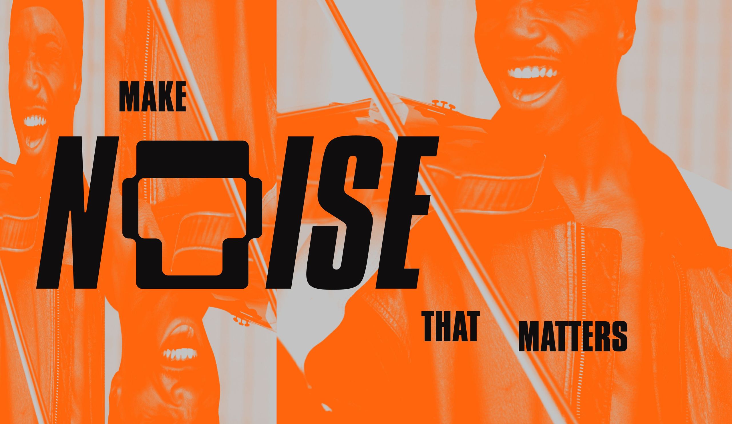
RCA has a 100-year legacy in music, art and culture. From David Bowie’s Aladdin Sane to Nina Simone’s ‘Nuff Said, the RCA logo has adorned the covers of some of the most influential albums in history. With a vision for a boundary-pushing, artist-first label, RCA tasked us with reinvigorating their brand strategy, brand identity, brand narrative, and website to mark their role as cultural tastemakers and position them for the next 100 years of artistry.

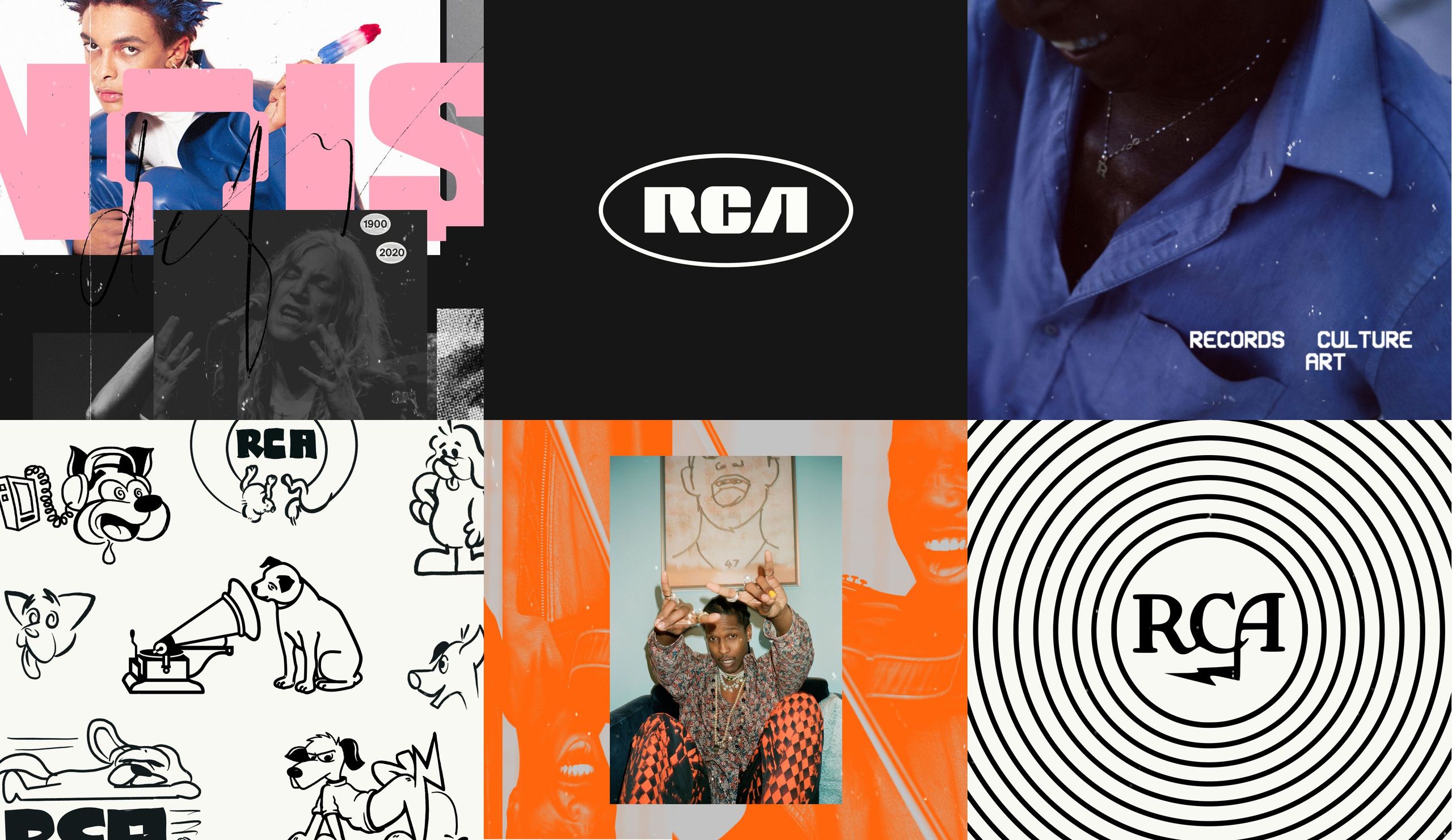
Over the years, a number of iterations of the RCA logo have held roles in the cultural zeitgeist, from the iconic Victor logo of the 1920’s to the type-forward lettering designed first in the 1960’s and revived in 2015. We explored hundreds of concepts and ultimately decided the type-forward version of 2015 held so much brand equity and cultural resonance that it was impossible to replace. All it needed was some fine-tuning for balance and symmetry to enhance its timeless quality.
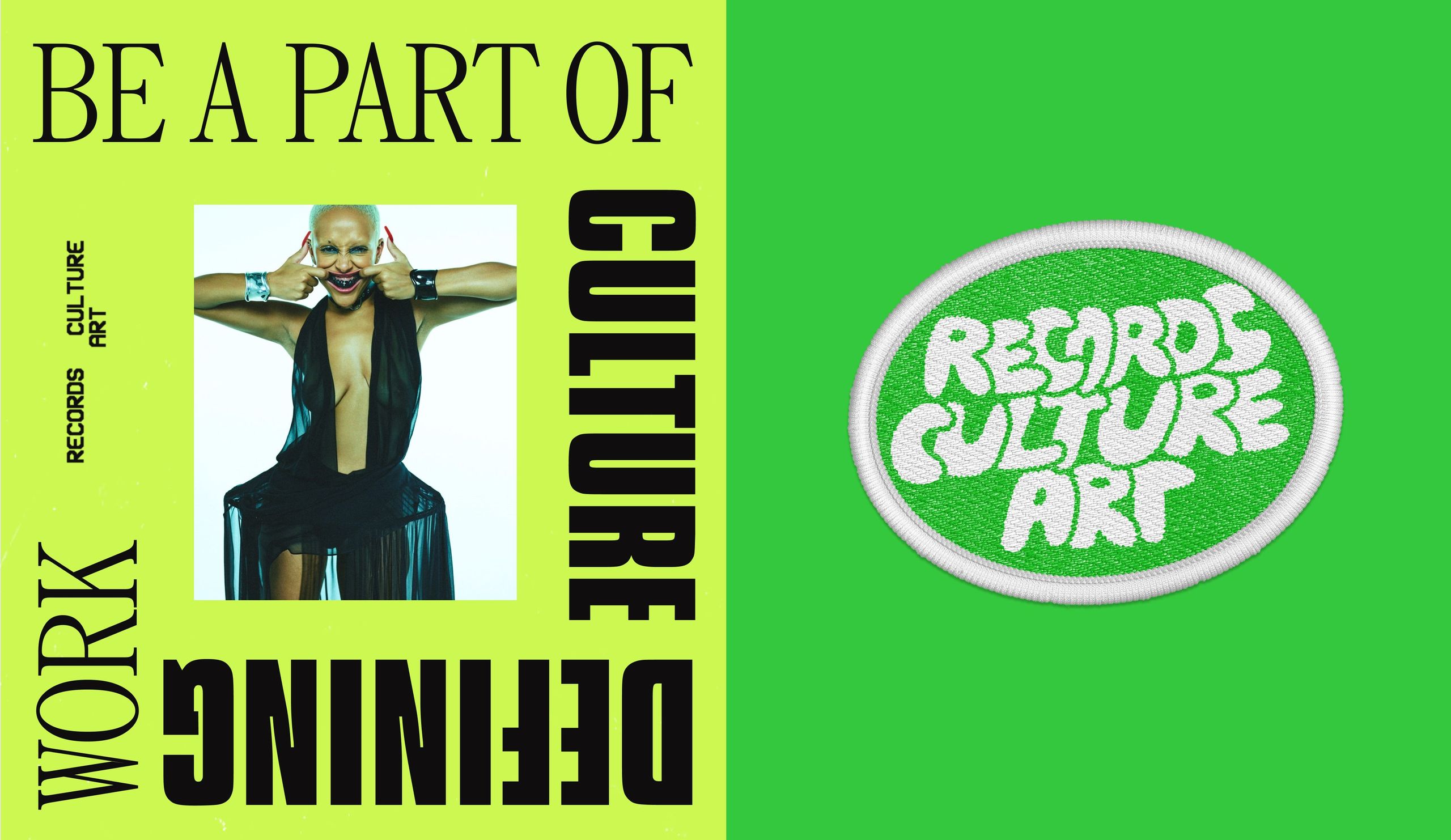
RCA’s name was an acronym that stood for ‘Radio Corporation of America’. Whilst it served a very literal purpose, it was time to shift the paradigm and give new meaning to the letters RCA, one that reflected its impact on the world around us.
It was important that the RCA brand represents more than just musical artists, but imbues the spirit and culture of artists more broadly, including visual artists, graphic designers, photographers, animators, illustrators, stylists, fashion designers, and more.
We came up with Records. Culture. Art. – an embodiment of RCA’s mission to defy everything you know about music labels, and represent so much more than music.
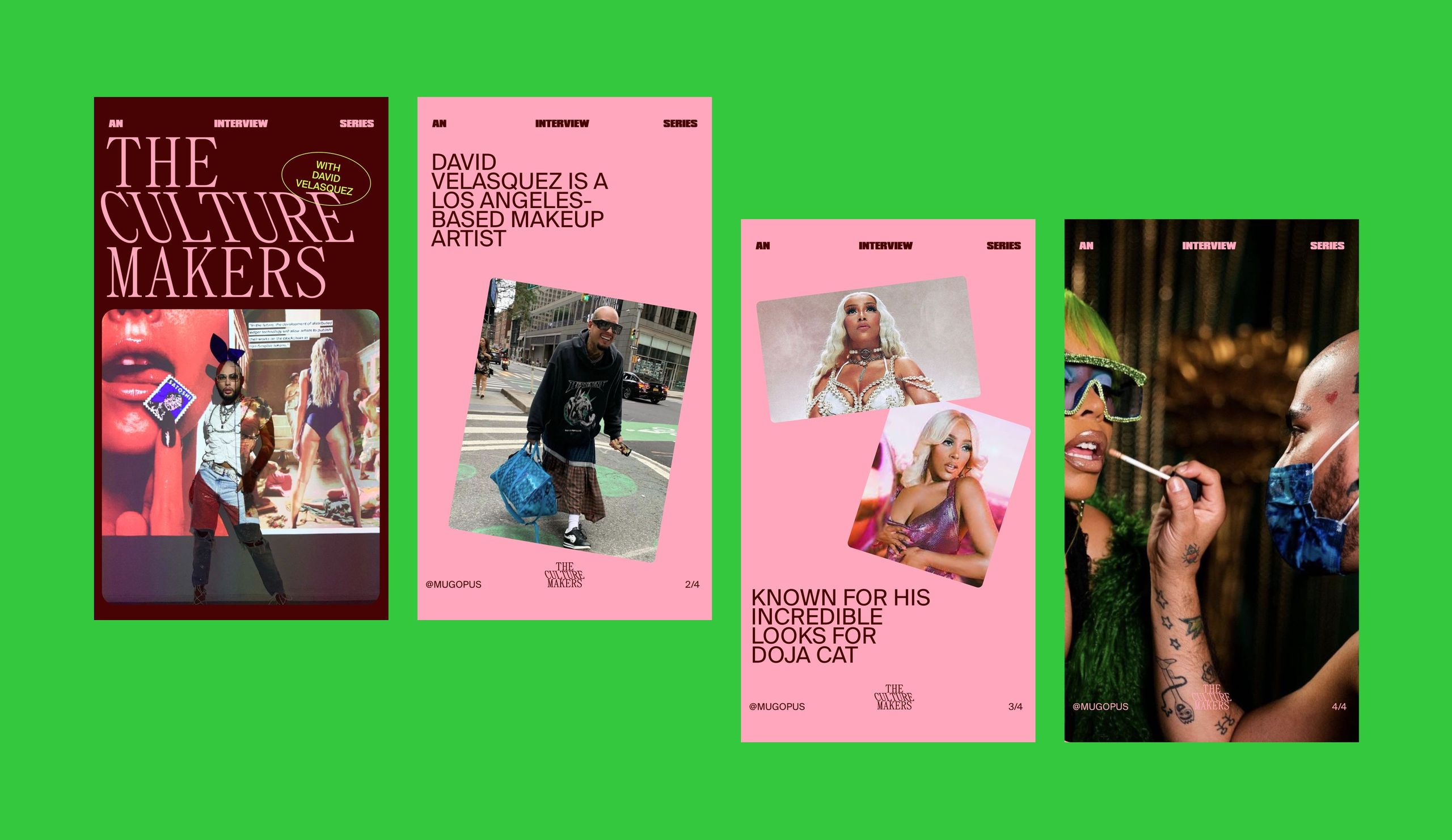

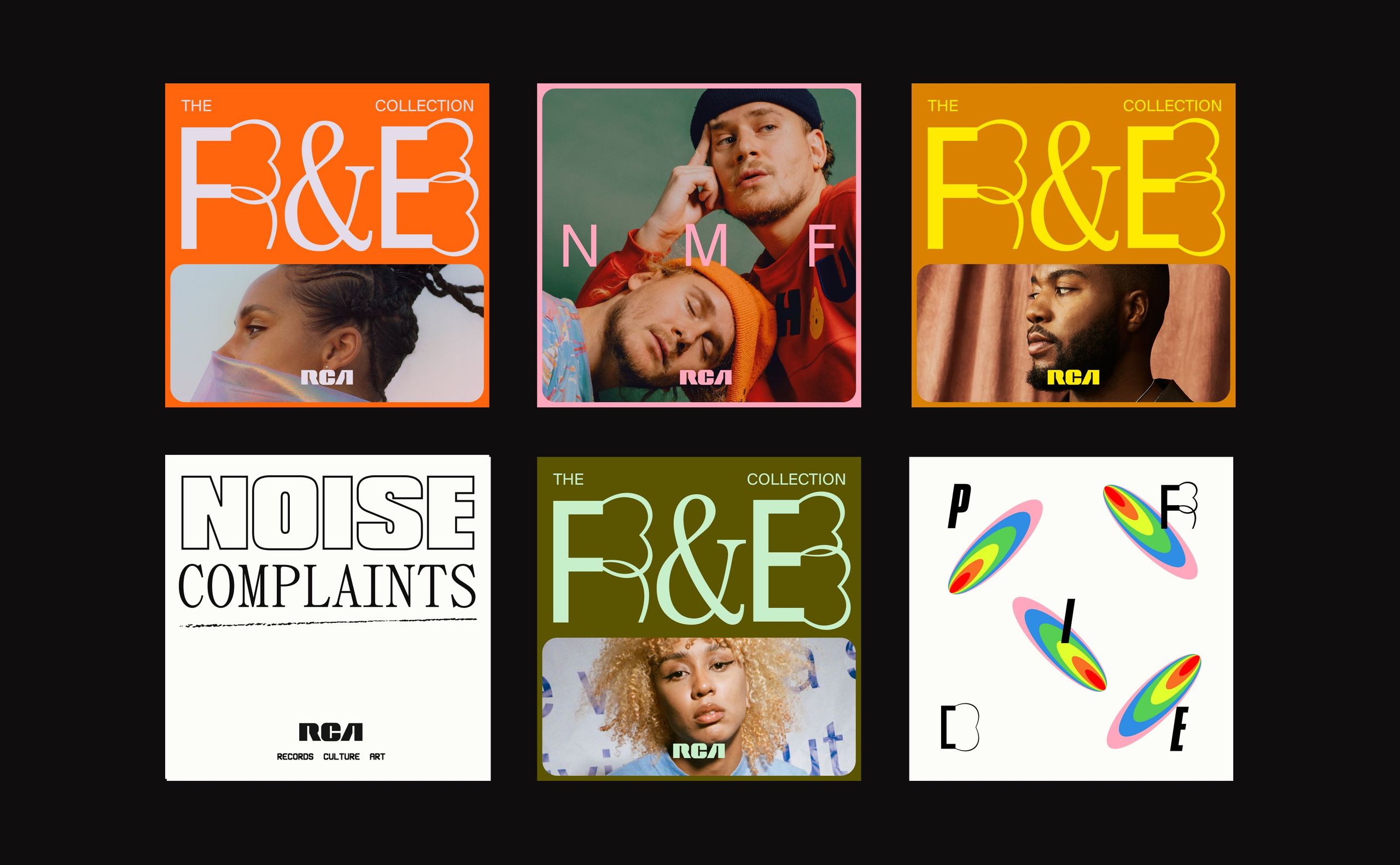
We created a boundary-pushing aesthetic that breathed new life into an antiquated industry with experimental graphics, imagery, typefaces and colours. The variable typefaces were designed by Elias Hanzer. The brand type system is a wild, eclectic mix of typefaces that speaks to the creativity and risk-taking of musical ventures. The cacophony of colour across the brand colour palette is striking, versatile, and echoes the eclectic mix of RCA artists and their music.
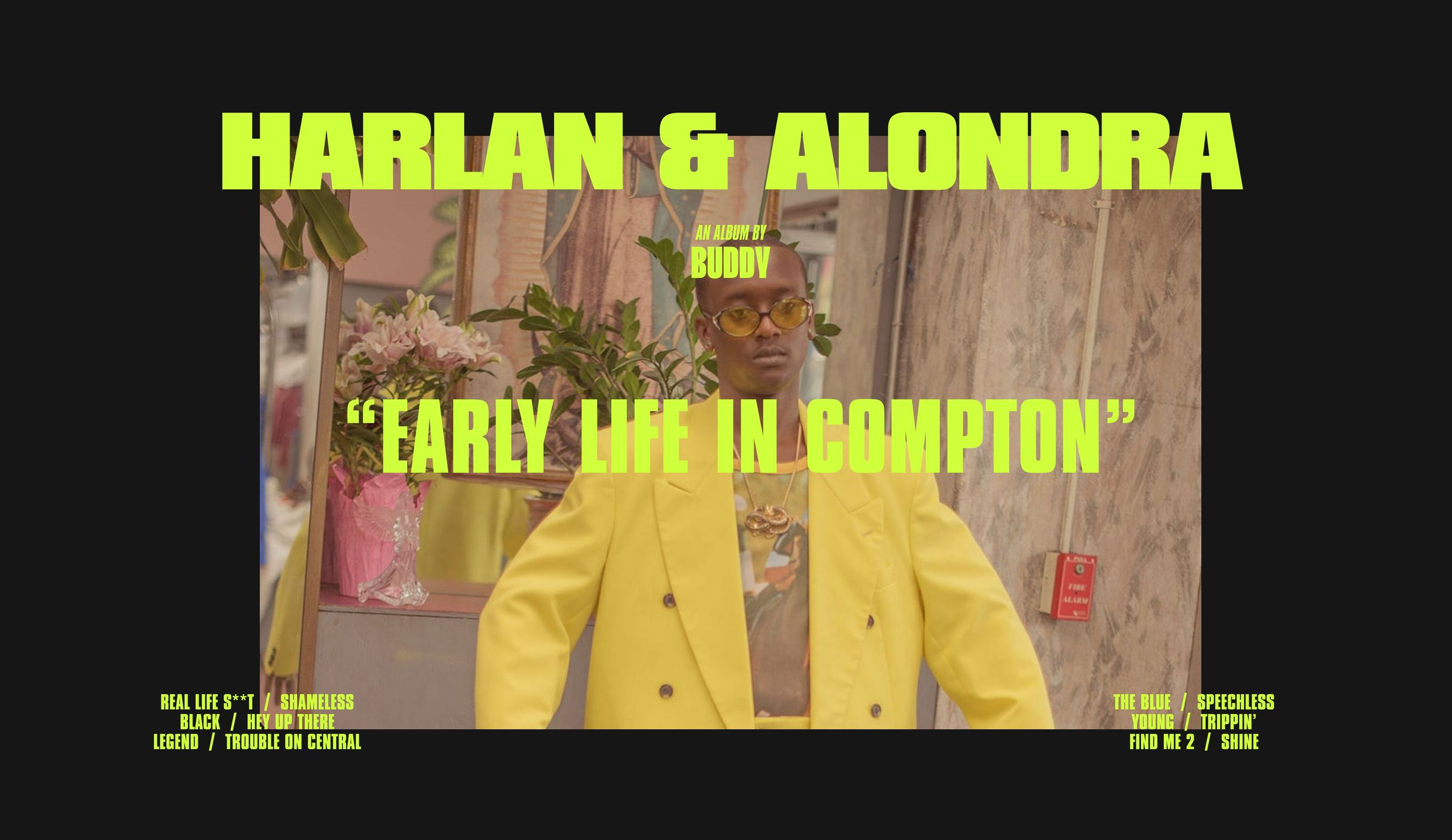
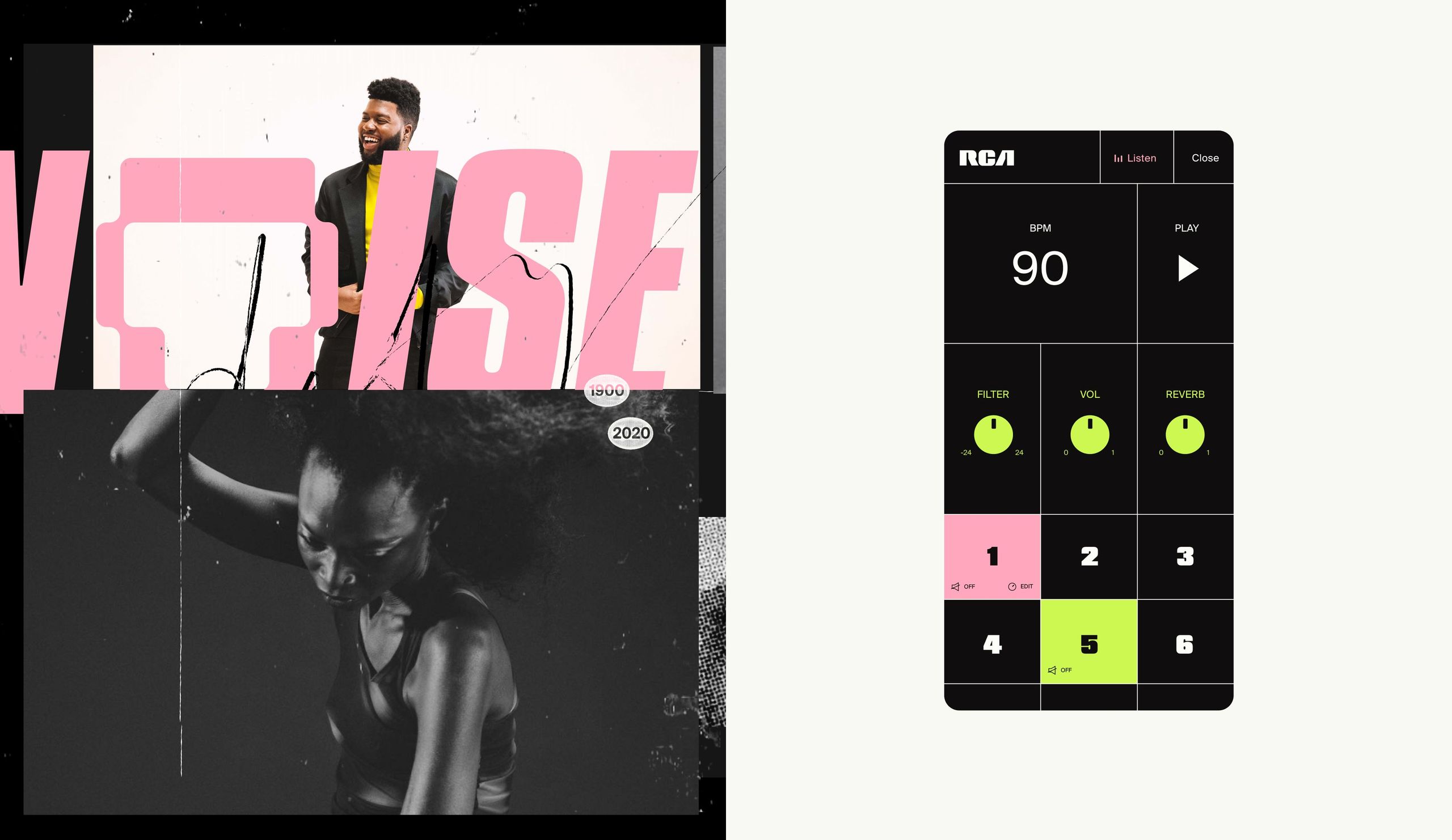
When it came time to roll out the new brand on the website, marketing collateral and merchandise we wanted to capture the essence of the evolution from a traditional record label to a catalyst for culture — by realising the vision of the new acronym, "Records, Culture, Art." With this tagline as a guiding ethos, we designed an edgy, experimental website that integrated motion and experiential elements. One of these experiential moments can be seen on the 404 page - where an interactive beat-maker allows you to mix and match beats to create your own eclectic track.
